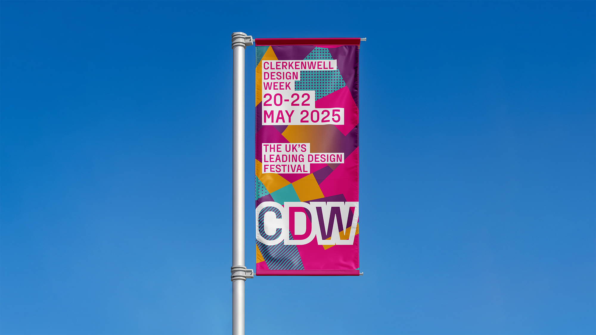
Clerkenwell Design Week's new visual identity

Clerkenwell Design Week 2025 features a new visual identity, designed by graphic designer Cai Taylor. His long-standing connection to Clerkenwell began during his time studying graphic design at the Back Hill campus of Central Saint Martins, where the area’s rich creative heritage left a lasting impression. Years later, as art director of The Clerkenwell Post, he got to learn more about the neighbourhood and became even more captivated by its unique character and creative spirit. Now, for this year’s CDW, Cai has come full circle, revisiting the festival’s identity, which he originally designed 15 years ago.
The 2025 campaign is anchored around Clerkenwell's historic streets and architecture, and the thriving community of architects and designers that work in this compact geographic area. “It was obvious from my first meeting with the organisers that it is the neighbourhood itself which makes CDW so unique and sets it apart from all the other design festivals around the world,” says Cai. “I felt it was important to reference the physicality of Clerkenwell in the designs, while also giving them a modern twist."

With this vision, Cai reimagined the festival’s iconic map, using bold geometric shapes, vibrant colours and CDW’s signature pink. These elements – combined with shading and graphic patterns referencing the local design industries – form a striking new visual identity. Cai's design also integrates different sections of the map as dynamic backgrounds across all materials, paired with clean, white blocks for messaging. Jedd Barry, Head of Marketing at Clerkenwell Design Week, adds: “This fresh, modern look mirrors our festival’s evolution, celebrating its growth and expansion while cementing its global reputation.”

The new identity is featured across all CDW platforms, including its website, advertising and social media.

)
)
)
)
)
)
)
)
)
)
)
)
)
)
)
)
)
)
)
)
)
)
)
)
)
)
)
)
)
)
)
)
)
)
)
)
)
)
)
)
)
)
)
)
)
)
)
)
)
)
)
)
)
)
)
)
)
)
)
)
)
)
)
)
)
)
)
)
)
)
)
)
)
)
)
)
)
)
)
)
)
)
)
)
)
)
)
)
)
)
)