CDW’s new visual identity

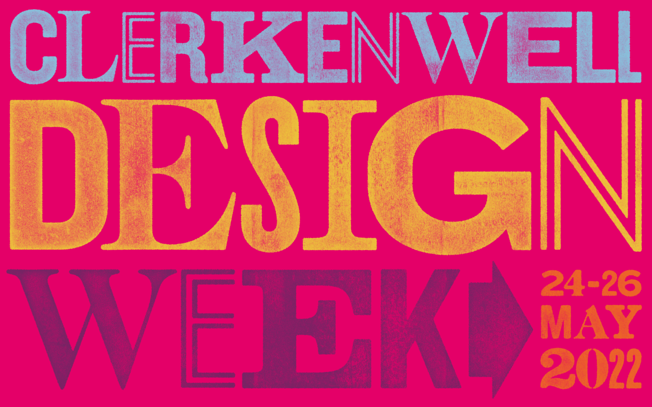
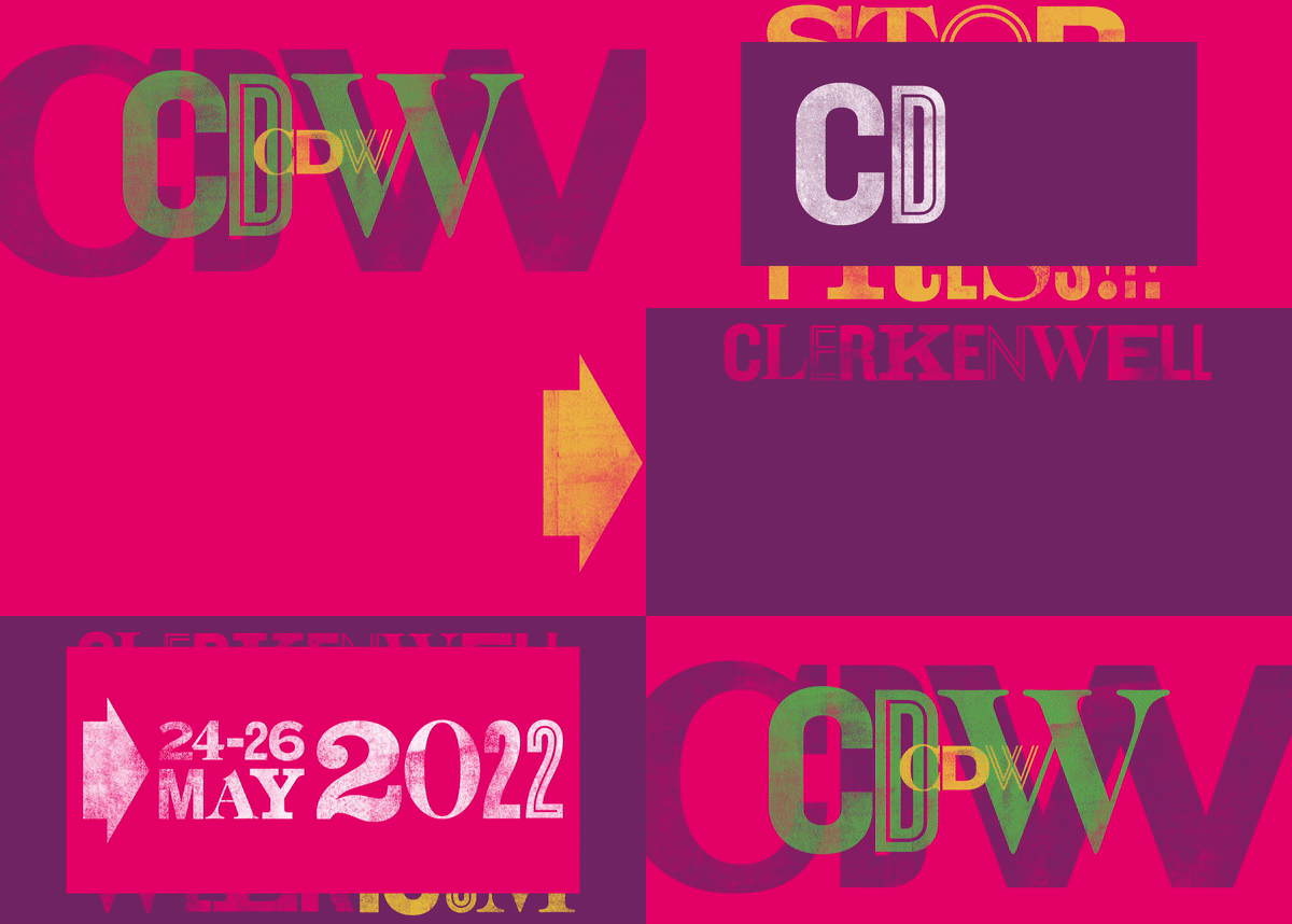
We're delighted to reveal CDW’s new visual identity for the 11th edition of the show. Working alongside long term collaborator Cai Taylor, the idea was to create an identity that is bold and joyful in keeping with CDW's spirit! To achieve this, five new colours were introduced to accompany the CDW Pink. The colours are used within the typography and layered over each other to give a playful collage-like texture.
The new campaign identity was inspired by the printing and craft industries that make up a big part of Clerkenwell’s creative history. The branding combines several typefaces, from traditional serif fonts that reference publishing and the old printing press, to contemporary display faces which have a geometric and architectural quality. These styles can be seen through much of the designs and products displayed at the festival. When the individual letters are combined, they create a bold and expressive typographic style.


)
)
)
)
)
)
)
)
)
)
)
)
)
)
)
)
)
)
)
)
)
)
)
)
)
)
)
)
)
)
)
)
)
)
)
)
)
)
)
)
)
)
)
)
)
)
)
)
)
)
)
)
)
)
)
)
)
)
)
)
)
)
)
)
)
)
)
)
)
)
)
)
)
)
)
)
)
)
)
)
)
)
)
)
)
)
)